1- Scoping
Timeframe and
planning: what needs to be done, how it needs to be done
I have 3 months for this assignment.
I have to produce a book.
It has to be done on as professional level as I can.
2- Creating
content
Researching subject
area. Writing material. Editing text.
Sourcing and/ or creating image
Day 1
I have decided to produce a book about colour, that will be
in the form of a children's picture book.
I have spent some time on research for this assignment and
these are the books I used to make this project as good as it can be.
Research for this assignment 5
Children's literature:
- We're
going on a Bear Hunt by Michael Rosen and illustrated Helen Oxenbury
- Ten
Little Fingers and Ten Little Toes by Mem Fox and Helen Oxenbury
- Blue
Chameleon by Emily Gravett
- Monkey
and Me by Emily Gravett
- Wolves
by Emily Gravett
- Meerkat
Mail by Emily Gravett
- Cave
Baby by Emily Gravett and Julia Donaldson
- The
journey home by Frann Preston-Gannon
- When
We're Together by Claire Freedman and Jane Chapman
- I
Love You Night and Day by Smriti Prasadam-Halls and Alison Brown
- The
Night Pirates by Peter HArris and Deborag Allwright
- Call
Me Gorgeous! by Giles and Alexandra Milton
- Aesop's
Fables by Saviour Priotta illustrated by Richard Johnson
- The
King with Horse's Ears by Eric Maddern illustrated by Paul Hess
- Little
Red by Lynn Roberts
illustrated by David Roberts
- That
pesky rat by Lauren Child
- The
wolves in the walls by Neil Gaiman illustrated by Dave McKean
- The
Day I swapped my Dad for Two Goldfish by Neil Gaiman illustrated by Dave
McKean
- The
Hutchinson Treasury of stories to read aloud by Janet Schuman
References about the colours
- Colour
mixing bible by Ian Sidaway
- Artist's
colour manual by Simon Jennings
- 500
acrylic mixes by Sharon Finmark
- Writing
Children's fiction by Yvonne Coppard and Linda Newbery
- How
to write a Children's picture book and get it published by Andrea Shavick
Brainstorm - Assignment V ( Book Design)
Look at an aspect of colour theory
Ideas:
Rainbow (possibly with a chameleon)
We follow a chameleon through the pages, possibly on the
right-hand page the rainbow builds up, ie first page has just red, second page
red and orange......
The chameleon would change colour each page to match the
colour discussed
Have 1 spread for each colour, plus white and black as
additive colour and subtractive colour. - 9 SPREADS
What would the story be?
Pulling apart a blanket
Intro: 1 - toddler asks granny to knit him something,
(he likes her knitted hats and scarves)
2 - reveal the blanket, patchwork, made up of 6 colours of
the colour wheel plus white and black.
Alternative - 1 - Granny knits toddler the blanket made up
of the colours. 2 -he loves it, takes it
everywhere and likes to pull the threads.....
Middle: 1 page for each colour, 8 SPREADS. toddler pulls the coloured thread out of the
blanket. On each page, on the right-hand
page is the blanket, getting smaller and smaller as the colour is removed, the
wool is pulled out and is seen wiggling around the spread. Red, for example, reminds him of a post box,
green of the grass.
On each of the colours a bit of theory, eg orange is a
secondary colour, made from red and yellow (maybe show the red and yellow
threads coming together to make orange)
End: 1 - he is sad because he has pulled out all of
the wool, he is left with a big pile of wool, but no blanket.
2 - Granny takes all the wool and makes a new blanket.
Pulling a blanket apart v. 2
Similar to above, but he takes each strand of wool to a
different room because it reminds him of an object, green to the garden for
grass etc. The rooms are not as full of
colour as 'making a blanket around the house'.
Probably this would mean i have to get rid of the shrinking blanket.
Making a blanket around the house
Intro: 1 - toddler visits granny but has left his
blanket at home, he is sad.
2 - granny says she will knit him something, (he likes her
knitted hats and scarves), she asks him which colour he would like, he says he
would like all the colours in the world.....
Middle: 1 page for each colour (6 colours of the
colour wheel, black and white) and each room of the house, 8 SPREADS. Eg. kitchen with generally red stuff in
background, with a red apple, green wool in the garden like grass etc.
In each room he finds some wool, and asks "what is this
doing here?".
On each of the colours a bit of theory, eg orange is a
secondary colour, made from red and yellow (maybe show the red and yellow
threads coming together to make orange)
End: 1 - he now walks around the house, gathering the
strands of wool together to find out whats going on, they are all leading to
one room.....
2 - where he finds Granny knitting him a blanket with all 8
colours, she has finished.

I took a picture of books for kids about the colours when I went to the library one day.
I wanted to create a space which I could relate to therefore
I designed a round house with the colours from the tertiary colours wheel.
I also created a
small book of 32 pages to play any time I want and make sure that my idea will
fit in the frame of 32 page book.
.jpg)
This round house is very helpful with this task as it makes
my idea more real and physical. I spent a good one hour designing this little house
and as a source of information I used "Colour mixing bible" by Ian
Sidaway page 13. I have started my tertiary colours from:
red, red-orange, orange, yellow-orange, yellow,
yellow-green,
green, blue-green, blue, blue-violet, violet,
red-violet
and red
.jpg)
Today I designed a few boys faces based on my little one picture, my goal was to create a bit older boy however I don't feel like I really succeeded... I m not happy with the sketches and it feels like it is not my style ....

Leo 6 months
.jpg)

.jpg)

Day 2
I have changed my plans a lot today. I'm not sure if I still like the idea for
the picture book. I tried to draw a
couple of faces of a little boy based on my son's photo, however I do not feel
that this is what I'm looking for - but I wonder what it is that I'm looking
for in this assignment.
This book has to be fun and colourful since it will be about
colour. It has to contain some part
at least that is funny or sweet or cuddly or fluffy - to appeal to the target
audience, children between 2 and 4.
Day 3
I came up with a different story which I am very confident
about. I think it will work much better
as a story for children. It is about a
cloud that happened to be very sad that appeared in a sunny valley where
colourful animals live. They try to
cheer her up, however she doesn't respond to them at all, she just cries (which
turn to rain). They don't realise, but
she remembers their colours and the order they appear:
1 - red - squirrel
2 - orange - fox
3 - yellow - wagtail
4 - green - frog
5 - blue - butterfly
6 - indigo - pigeon
7 - violet - mole
At the end she becomes happy and creates a beautiful rainbow
which she leaves them as a present for cheering her up.
This seems a good idea that combines a story about the power
of colours, and the animals will appeal to the children. I am not sure whether I would like to have
rhymes the text as some of the best children's books do - perhaps I will use
rhymes only at the end of the sentences, but we will see.
3- Design
Page set-up, page
layout, choosing typeface, inputting and arranging text and image elements
.jpg)
.jpg)
.jpg)
.jpg)
.jpg)
.jpg)
.jpg)
.jpg)
.jpg)
.jpg)
.jpg)
.jpg)
.jpg)
.jpg)
.jpg)
.jpg)
.jpg)
Day 4
I designed the background for the valley. I used brown paper, string and paint to
create it, and will edit it digitally with Photoshop. I would like to create a beautiful colourful
place, where the sun is shining and has a welcoming feel. This will give a contrast when the sad cloud
appears.
I have to say something - I can't resist brown string and
paper as a combination for collages. It
just feels so ecological and close to nature.
.jpg)
.jpg)
.jpg)

first stage for the background

Day 5
I am currently working on the animals, trying to create the
nicest look for all of them. I used the
book about the wildlife
as a source of illustration. I painted
and sketched the squirrel and the fox. I
used the light box to create the same characters, however I am not sure again
about the look. The animals have to be
one of a kind, nice and easy to remember for the young audience. I know I may have to spend a couple of days
working on them.

.jpg)

.jpg)
.jpg)
.jpg)
.jpg)

.jpg)
.jpg)
Day 6
I will create the rainbow which is the main part of the
book, I would like it to be as vibrant as I can imagine. I want to use bright colours but not too
'shouty', if I can say. Possibly I will
use more pastel colours to keep the colours vibrant, but give the images a
softer look. We will see
a.jpg)
b.jpg)
c.jpg)
I used water based paints for this illustration, then took
photos and worked on them on Photoshop.
Which of them do I like the most?
Possibly A as it will blend nicely with the background.
Day 7
I have to go back to the background as I didn't like it and
now doesn't fit in with the style of the animals. There was something missing, something that
would give it a feeling of depth. I
pasted my scanned hand made paper into that illustration then created a layer
that looks like soft grass with some petals.

Now I like it more, I will leave it as it is as I do not
want to overwork it.
Day 8
I have to move to the bigger space. I just couldn't work on the small paper while
I was trying to create the perfect animals.
I was so lucky to have a friend who had an unwanted wall in their
garage. There have been a few times in
the past when I have painted lovely paintings and murals on walls. Once I painted 5 walls in a care home for
residents with dementia. I remember the
creative joy and massive space I had to use.
Another time I painted two walls for my baby Leo in his nursery room. This was space where I was very creative and
loved the colours I had available. The colours
of paints that we used for the wall are much very intense and bright. This is what I need for this project, as I
would like to create a book with a texture different to others in book shops.


Maybe this is a bad move to start such a big painting but I
have to try at least. I know that it
will demand from me a few more days to paint a character on the wall then to
work on them on Photoshop. But it is a
risk worth taking.
xxx
I did spend a few days painting two characters on the
wall. It was a bit difficult to find a
perfect moment when there was enough daylight in the garage while my little one
was having a morning nap. I set myself a
goal to paint two different characters a day, then to take a good photo of my
paintings while there was daylight, so I could easily work on them on the
computer in the evening.
I am very happy so far.
I will keep doing what I was doing for the last few days. I can already see a big difference in the way
I use a brush to create the animal characters.
My brush lines are much more free and creative if I may say so, using a
physical paint brush compared to my graphics table on the computer.
Walking down the street Trying to run from the coming rain I spotted a big cloud that happened to be a perfect inspiration for my main character. I took a picture to be able study that shape bit closer.

Walking down the street Trying to run from the coming rain I spotted a big cloud that happened to be a perfect inspiration for my main character. I took a picture to be able study that shape bit closer.
.jpg)
.jpg)
.jpg)
.jpg)
.jpg)
.jpg)
.jpg)
.jpg)
Day 9
These are my animals and I am very happy with them. I haven't finish any of them just to give myself more space and creative freedom in terms of the facial expressions. I love the colours and the overall look. Now let's create some movements and make them
alive.
Day 10
This is the cloud I have painted on the
wall. I wanted to make a collage from
the one I have done a few days ago with string.
However after a few trials I made the decision that it doesn't look
spectacular at all. I will stick only to
the wall painting with some work on Photoshop later. I want to have a cloud that looks sad. I took a great photo one day while I was
walking, I thought that it was a good source of inspiration for Mrs. Cloud.


Day 11
I spent the last few days working with the
illustrations. This is what I have
created after all. I decided to place on
my blog only one or two illustrations of the animals while they were in
progress and the last one as the final illustration. Otherwise I could take up so much space on my
blog with unnecessary pictures.
Here are my final illustrations of the animals


Day 12
Today I really need to work on the font type and the words
themselves. I wish to achieve a playful,
yet professional result at the end. The
font shouldn't be too hard to read at the same time the colour has to be
visible. Will I find the right one to be
happy with after all? I am so focused to
make it work as a book, therefore I know I will find the bets one.
To make it easy to choose from, I will write the name of the
font and if it is italic or not. Then I
will place them on the actual background of the valley. Yes, I think that is a very good idea. It should make my choice easy to make.
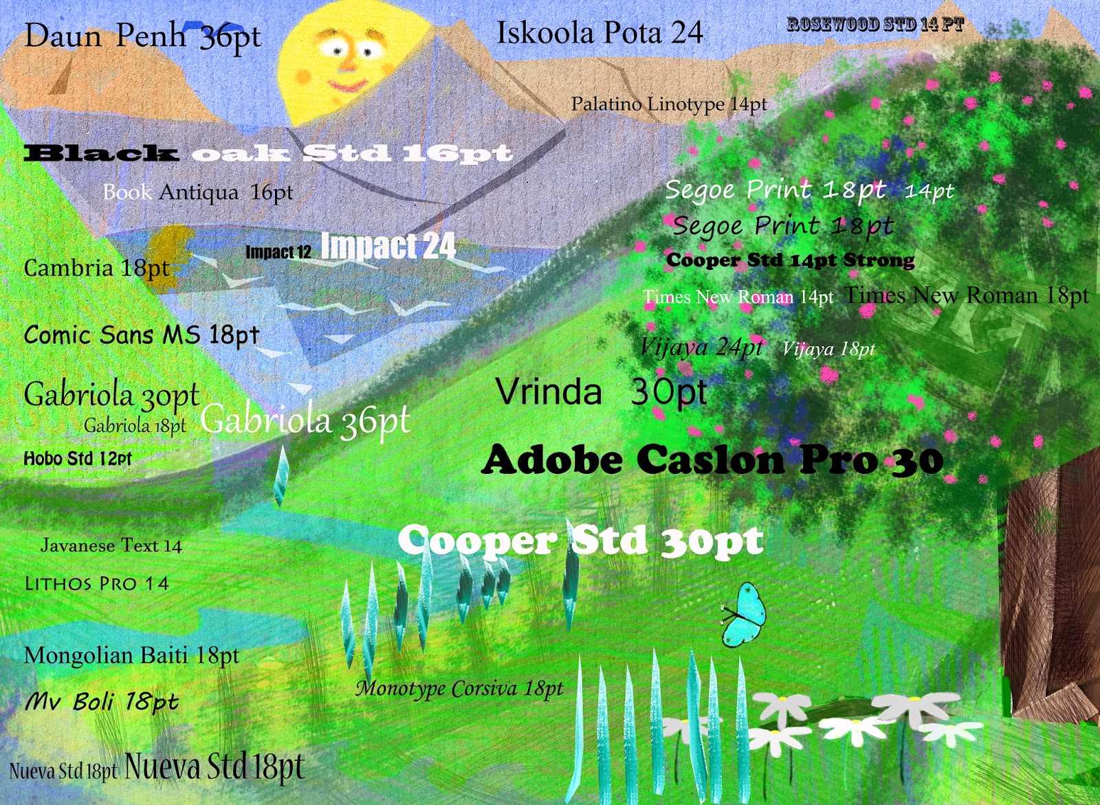
xxx
This is a finished page with my top choices and the type
size. According to the website http://childrensbookcreation.blogspot.co.uk/2011/05/typography-for-early-readers.html the size of the type
should be 14-18 pt,
therefore I think the font Comic Sans Ms 18pt
looks good to me. I'm not sure about the
colour - should I leave it al in black or should I write in white?
The white text works well, however I don't think it will
look visible enough on every background.
How about the font Cooper Std 14pt Strong,
does it look appropriate for a picture book?
Yes, I think it does. The shape
of the type is round enough and according to this website, the shape of the font
should be open and round so parents can read aloud to children easily. I think that this font and size and colour
works the best so far.
xxx
This is all getting more exciting than I thought
before. Choosing a title is a very
important of this assignment. I have to
imagine myself in a bookshop and looking at the books. Which one would I like to buy - or which one
would a child like to have, a book with an interesting and playful title
definitely.
According to the book "How to write a childrens'
picture book and get it published", no matter how brilliant your title is,
somebody somewhere will change it.
Anyway this book suggests to keep the title fairly short and simple,
interesting and make sure that nobody else has used it before.
So far, I'm thinking to choose from: "How the animals
help to create the rainbow", "The sad cloud and the rainbow",
"The animal rainbow".
I have done some preliminary research online and found a
small number of books with similar titles.
I actually like the style of the illustrations in "l'arc en ciel
des animeaux" (The animal rainbow) by Sebastiano Ranchetti, however
looking at the content, I am happy that my book is original and tells a
completely different story.
I think "The animal rainbow" sounds the best idea
so far, it is simple and easy to remember.
Day 13
Today I have learnt how to create the spine of the book in
InDesign. I am so proud of myself as it
looks very good to me. I watched a short
tutorial on YouTube and I can recommend it to everyone who has
just started with this program. It was
very easy to follow and understand.

4-
Pre-production
Preparing for
print. Saving and storing.
Day 14
I went to the local printing studio to get a quote for a
couple of books to be printed and what sort of dimensions I should save the
file etc. I have a few places to go like
Prontoprint where they could print for me for a reasonable price. However the binding is a bit more worrying
as it would only be in the form of stapling which I am not happy about. I would like my book to look as professional
as possible, therefore I do not want to staple it as it will look more like a
booklet than a proper picture book.
There is a another independent family printing studio,
however the owner is going on paternity leave
- luckily for him, but not so lucky for me as he is unable to print my
book. Anyway, because of his studio
capacity, he would have to charge me over £100 per book, which is quite a lot.
I was so lucky to have a third choice, which is another
independent business called Copyzone. I
know they were very busy at the moment, however the price quoted was good and
it would only take a few days. I think I
have made my choice about the place to print.
Also the best thing about Copyzone at the moment is that they will bind
it, rather than staple it, so I think we have a winner!......
 page 1 front cover


pages 4 and 5
Unfortunately I had some technical problems with pages 6 and 7 to place them on my blog, therefore my story starts from the page number 8.
Page number 8 places next to number 9 looks too different, as thought they have been taken from different books. They look fine to me individually, however I think the styles I used are too different.

This illustration looks like it has a style from 'The Journey Home' in terms of the materials used and the rough shapes of the characters. The animals, the trees are similar to the style from this book. I used different materials to create them so the background will be separate from the characters.


pages 28 and 29


5- Printing and production
Day 15


I got an unexpected call, I thought there was going to be a
problem with Copyzone, but they said they were able to print 10 sample books
for me. When I arrived I was delighted
to see 10 copies of my book, printed, fully bound like a finished product.
It feels good, much different to any other creative piece I
have ever made. With a painting, or
drawing you can see the product developing before your eyes. However with this book, I finished my work up
to the point of a computer file, then it went to the printer, and now it is a
physical piece!
Because of this, I feel both very proud, but also this
distance helps me to be critical of my creation, perhaps more critical than I
have ever been able to be before (like with paintings for example).
Overall, I am very pleased with the feel of the book, the
binding is very good, and especially the front cover (I am glad I did some
research into the covers and spine).
Overall the book is smaller than my original plan (300mm x
200mm), it now sits at 205mm x 170mm, I have found out that this is the best
that the printer could do. Obviously,
there have been many successful and loved picture books that are small, for
example The Very Hungry Caterpillar or the Mr Men series. The size of the pages itself is not an issue
for me, however if I were to print the book again I would make some
improvements.
Due to communication issues, it appears that the printer cut
off some sections of most pages, rather than resize them. In some pages this is not particularly
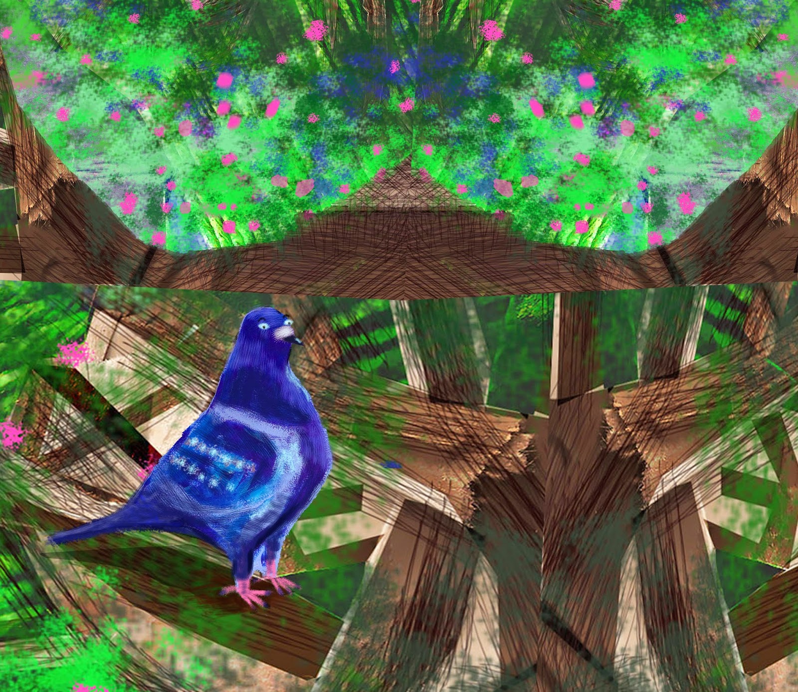
noticeable, however on some pages, Mrs. Cloud is cut in half. The most disappointing for me The main
problem for me is the spread after the violet mole, where, in my digital
illustration there were all of the animals on the right hand edge. Because of the cutting process, now you can
only really see the fox and squirrel tails and a pigeon's claw - what a shame
since this was the part of the book, when the animals actually come together to
make a rainbow with their colours!
There are two other areas I would like to focus on, in my
self-assessment of my 'finished product', colour and type.
Colour
When talking to different printers, they mentioned that
colours on my screen will be different to those on the finished, paper
version. I know this is true from
previous experience, however in this case the differences are sometimes
extreme. For a project about colour,
I am a little disappointed by the way the colours have come out in this version
of the book, so this is one area I would look to improve on if I had another
chance.
Broadly speaking, the book is made up of 3 sections, the
beginning and end pages tend to have quite open skies with darker colours at
the bottom of the pages. The middle
section, mainly with the 7 colour themes with very little 'open' sky. I know this part of the book is about the
dark cloud causing the rain in the valley, however I think the colour
saturation needs to be changed, as it results in pages that are too dark, and
the colours lose their vibrancy.
Its odd, because when working on my computer, these 'middle'
pages were my favourite, however now I prefer the beginning and end. The front cover is a brilliant example. With two main colours, green grass and a
sand-coloured sky, the background is relatively simple. Against this simple background are the 7
animals and the rainbow, and in this illustration, I can feel the vibrant
colours glowing from the page. However
in the 'middle' pages, I now think there are too many colours, such as blue in
the river, green in the grass and tree, red in the apples in the tree. The most obvious pages that need looking at
are the green and indigo rainbows, as these seem to blend into the background
so much (even Mrs. Cloud blends into the indigo rainbow in a way I hadn't
noticed before).
Having worked at my computer for so long, I guess I forgot
that it is part of the process to have a physical book in front of me.
Type
I am pleased with the potential of my chosen font Daun Penh 30pt Regular. With the size of the type and the size of the
book, it works well, is easy to read and doesn't look too formal.
However (this is why I saved these comments until mentioning
colour above), the text in the middle section becomes illegible at times
especially on the blue and indigo pages, where you have to make a real effort
to find the text. Again, I feel that the
typeset works very well at the beginning and end, where the black colour of the
text sits well against the more pastel-coloured backgrounds. I am particularly proud of the small clouds
used to show what Mrs. Cloud is saying the last 2 spreads, as it gives a good
background for the text.
Again this is an odd reflection of how this assignment has
worked out in the end. Those small
clouds were an idea I has at the very last moment to make it clear that the
words were from Mrs. Cloud, and they seem to work very well. Whereas the other speech bubbles in the
middle section (such as with the butterflies and pigeon) were a favourite idea
early on, but this version makes it hard to read the text easily.
Conclusion
Overall I am pleased with my work. I think I have used the skills and experience
from my other assignments, in applying type, colour, paper and content to my
childrens' picture book. While I accept
there are some areas for improvement in my physical paper book, some of the
problems I encountered may just have happened because it was my first attempt.
From one point of view I am still happy with the digital
version of my book, but I will certainly (for my own benefit if nothing else)
look at some of the areas, such as looking at the colour saturation and making
the text more visible in the middle section.
Perhaps as a last impression and one thing that worked surprisingly well
- the rainbows that sit across a couple of the double page spreads work well,
despite the gutters - this is a good example of a good idea working digitally
and also in the paper book.
Perhaps it is fitting that at the end of this course, I have
finally seen where the digital work and the physical final product both need
each other and where one format may look appropriate, the same image in the
other format can look surprisingly different, and you need to master both
formats.