Assignment 2
Jacket design
The brief
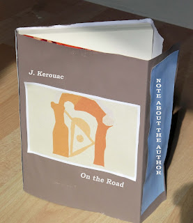
Create jacket artwork for the Beat generation classic, “ On the Road “ by Jack Kerouac. The
publishers, Viking Press, have decided to re-release this title in hardback
form, and want a new jacket design to reflect the beatnik and avant-garde
nature of this classic novel.
Requirements
Your design will need to include front, back, spine and
flaps. You’ll need to source images,
either from Bridgeman Art Library , Oxford Art Online, or crate your own
original imagery-illustration, photography or artwork. You will need to produce
three different design versions and each will need to be mocked-up on the hardback
book and photographed.
Research and develop ideas
The plot
On the Road by Jack Kerouac -Viking Press
The book cover is very simple . The colour on the front
cover is black with the small illustration in the middle of the page. The
illustration looks very peculiar to me therefore I need to come with something
different to my art interests. As far as I can see the illustration does not sent
the straight message to the viewer. There is no simple image or a shape that
the reader can easy relate to .
I think I need to keep it as simple as I can . I will use
one colour for the background definitely. However, my only question is: Where
can I go to look for the inspiration for this illustration?
I want to crate something modern with some old fashion
themes and shapes. The only place that came to my mind was The Henry Moore Foundation
in Perry Green near the place I leave. I was very lucky to be a friend of that
foundation; therefore, I went there a few times to contemplate the sculptures created
by Henry Moore.
Why did I think about that place? The reason for that was
the amount of different and bizarre shapes created by this famous artist.
I took two pictures at The Henry Moore Foundation at Perry Green early this May 2013
Henry Moore ' Sheep Piece '1971-72
Henry Moore ' Large Reclining Figure 1984
Henry Moore ' Large Upright - Internal/External Form 1981-82
Henry Moree 'Three Piece Sculpture: Vertebrae 1968
Henry Moree ' The Arch ' 1969

Sketches reduced to the simple shapes - black ink and pen on paper
Develop the idea using the computer program
First stage of mock-up
Image 1 on different backgrounds:
How does the background react with the main illustration?
The illustration disappears on the blue background therefore;
I will not be using this for my assignment.
The illustration is more visible on this background however;
it is not my favourite combination of colours.
This option looks much better so far. I like the contrast between the illustration,
the background and the other parts of the book cover. I think I might be using this combination as
a finish book cover.
This one is definitely no for me. I do not like the white parts of the book cover,
they do not go well with the illustration.
There is a good contrast between the background and the illustration. However, there is not much difference between the background and the other parts of the book cover. Does the temperature of the illustration go well with the background? I m not so sure.
Image 2 on different backgrounds
I do like the contrast between the illustration and the
background colour. However, the book cover parts merge with the blue background. Is this the best combination? Does not look like that to me.
The colours of the background and the parts of the book
cover clash completely. Moreover, the
illustration looks bad on this background.
I do like this one. I
think the overlook is good and it might be the best choice so far. The
illustration is definitely visible here and I am happy with the temperature of
the background and the other parts.
I don’t like none of them . The colours clash on both
pictures and the illustration seems to disappear.
Image 3 on different backgrounds
This is the last illustration that needs comparing with the
colour of the background. I will use the
experience from the two previous illustrations and I will make my decision base
on that. I think this is the best choice
based on the colour temperature and the shapes on my illustration.
Final visual outcomes:
illustration 1
book cover
book spine
book flap
book back
Illustration 2
book cover
book spine
book flap
back of the book
illustration 3
book spine
book flap
the back of the book


